Advanced Concepts
Error Codes
Welcome! You’re about to fill out a form powered by SmarkForm. Some forms include keyboard navigation, shortcuts, or dynamic lists to make common tasks more convenient.
Available behavior depends on the form’s markup, native controls, browser, and enabled features; forms may not provide every behavior in this guide.
New to SmarkForm? Don’t worry! These forms work just like regular forms, but with helpful enhancements. You can use them normally, or speed things up with the tips below.
Some forms use SmarkForm’s keyboard navigation to help you move between fields. The available behavior depends on the form and its controls.
Use Enter and Shift+Enter to jump directly between form fields:
⏎ — Move to the next field⇧⏎ — Move to the previous fieldEnter navigation skips buttons and other non-field components. Use Tab and Shift+Tab to follow the browser’s normal focus order, which also depends on disabled controls and the form’s markup.
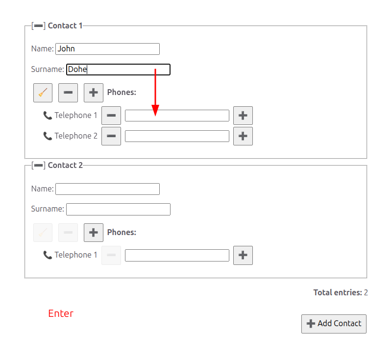
Tip: Enter navigation can be faster than tabbing through every element when you want to move directly between fields.
If you need to navigate through all elements (including buttons and links), use the standard Tab key:
↹ — Move to the next element (fields, buttons, links)⇧↹ — Move to the previous elementIn multiline text areas (textarea fields), pressing Enter adds a new line within the textarea as usual. To move to the next field instead, use:
Note: SmarkForm listens for Ctrl, not macOS Command/Meta. Native controls and browser shortcuts may also handle key combinations.
Some forms configure context-aware keyboard shortcuts (hotkeys) for actions. They supplement the controls and focus order provided by the form.
To see which keyboard shortcuts are available at any moment:
Press and hold the Ctrl key ⌨️
While holding Ctrl, visual hints may appear next to enabled triggers with configured hotkeys. Release Ctrl to hide the hints. These hints are CSS-generated visual content; their exposure to assistive technology has not been verified.
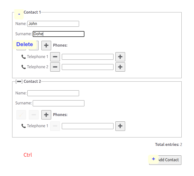
Try it now! If you’re filling out a form, hold down Ctrl to see what shortcuts are available.
SmarkForm uses an intelligent, context-aware hotkey system that makes forms intuitive and efficient:
The same hotkey can be used in different parts of the form. For example, many forms use + to add items and − to remove items. If your form has multiple lists (like a list of contacts, each with their own list of phone numbers), the same + hotkey can be used for all of them without conflicts.
SmarkForm resolves matching hotkeys from the current focus context. For example, if a form configures + for adding a phone, Ctrl+Plus can add a phone while focus is inside that list. A disabled trigger does not run, and available shortcuts depend on how the form is configured.
This context-aware behavior lets a form reuse keys such as +, −, and Delete in different regions. The form’s visible controls remain the fallback when a hotkey is unavailable.
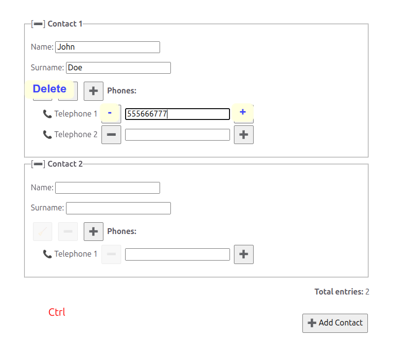
Example: Imagine filling out a contact list where each contact has their own list of phone numbers. When you’re focused on a phone field, Ctrl+Plus adds another phone number to that contact. The same hotkey is reused naturally across different contexts!
Sometimes you need to access an action in an outer context. For instance, while filling in a phone number, you might want to add a new contact (outer context) rather than another phone number (current context).
To access second-level hotkeys, hold Ctrl+Alt together. Command/Meta is not an alternate modifier in the current implementation.
This reveals hotkeys from the next level up in the form hierarchy. In our contact list example:
This two-level system can expose a matching outer-context trigger when the form has configured one. It does not make every form action available by keyboard.
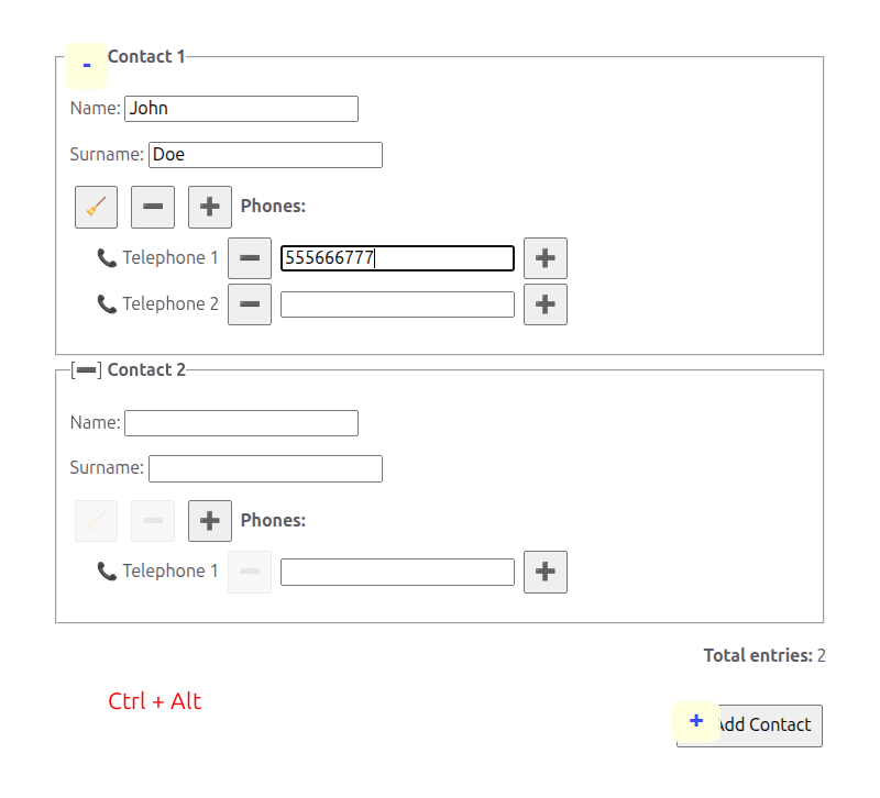
Try it: Hold Ctrl to see nearby actions, then also hold Alt to reveal actions from the outer context. It’s more intuitive in practice than in words!
While the actual hotkeys available depend on how each form is configured, here are some patterns you’ll frequently encounter:
Remember: hold Ctrl to discover what’s available in any specific form. The hints will show you exactly which shortcuts you can use. Also, holding Ctrl+Alt may reveal additional shortcuts for the same keys from the outer context.
Many forms include dynamic lists where you can add, remove, or reorder items.
Look for buttons with plus (+) or minus (−) icons, or use hotkeys if configured:
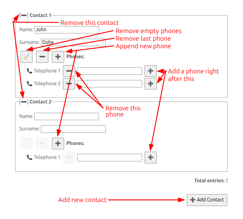
Finding hotkeys: Hold Ctrl to see which keyboard shortcuts are available for the specific form you’re using. The actual hotkeys depend on how the form was designed.
Empty items: A blank row may already be present because of the list’s initial item count. Filling the last row does not automatically add another; use the form’s Add control or hotkey when available.
Some forms allow you to reorder list items by dragging and dropping. The way you grab an item to drag it depends on how the form was designed:
With a drag handle — Many forms include a dedicated drag handle, often displayed as a ☰ icon or a similar visual cue. Grab that handle to drag the item. The rest of the item (including any text fields) behaves normally: you can still click, focus, and select text inside those fields without accidentally starting a drag.
Without a drag handle — If no drag handle is present, the entire item is draggable. You can click and hold anywhere on the item (except inside text inputs or buttons) to start dragging.
In both cases:
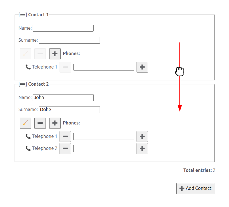
Note: Not all lists allow for reordering. This feature is enabled based on the specific use case and requirements of each form.
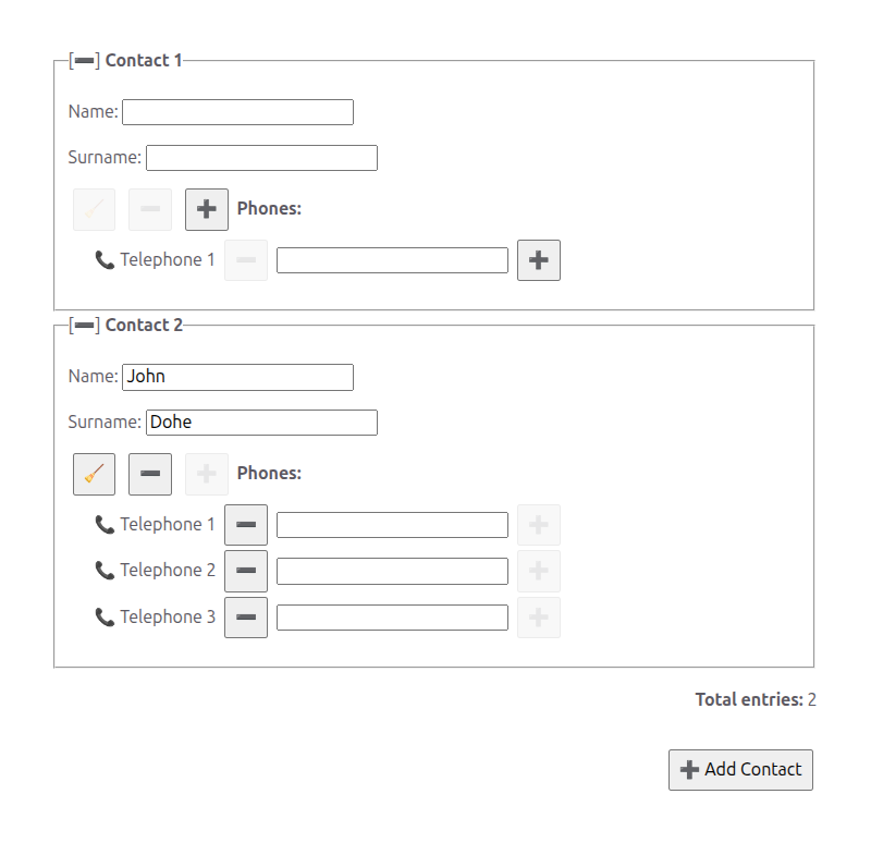
Some lists have minimum or maximum limits:
These limits are intentional constraints based on the form’s requirements. When a button is disabled, it means you’ve reached a limit — you can still modify existing items, but cannot add more or remove required ones. You can be presented with an empty item to fill in because it is expected to usually be at least 1 item, but you can remove it if the minimum is 0. If you just leave the fields blank, validation could fail. If you remove the item, it is more intentional -you are explicitly saying “There is no such item”. This way the validation can be more accurate and helpful.
SmarkForm’s file, image, video, and audio fields share the same familiar upload patterns: choose a file with an upload button or picker, drop it onto the field, or paste it when the form supports paste. They all embed the selected bytes in the form value, so the generic file field comes first and the other types build on it.
File fields display the selected filename and metadata rather than a preview. Use the field’s upload trigger, drag and drop, or paste. A download action can return the embedded bytes to the user. The visible filename is editable and takes precedence when the form is exported or downloaded.
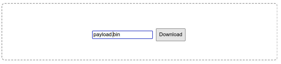
Image fields show the selected image directly in the form. Click the image when it is configured as a picker, or use the visible upload trigger. Delete and Backspace clear the image and restore its placeholder. In a figure or list item, the editable caption changes the exported filename; use Tab to reach the caption separately from the image field.
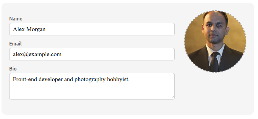
Video fields are single SmarkForm fields even when they contain a native player. Use Enter and Shift+Enter to move between form fields. When the video has focus:
Native video controls handle play, pause, seeking, volume, and fullscreen. An explicit upload trigger is recommended beside a video that uses native controls, because clicking the media surface should remain available for playback.
When a video is wrapped in a figure or list item, its editable caption is a separate browser control. Tab and Shift+Tab reach the caption and nearby buttons, while Enter/Shift+Enter continue to treat the video itself as one SmarkForm field. Delete and Backspace edit caption text while the caption is focused; they clear the video only when the video field has focus.
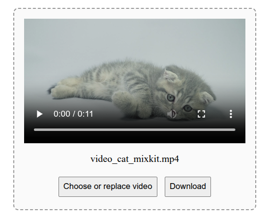
Audio fields behave like video fields, but an empty <audio> element has no visual area of its own — a form that wants an obvious empty state wraps it in a visible container or provides an upload trigger. Use Enter and Shift+Enter to move between form fields. When the audio field has focus:
Native audio controls handle play, pause, seeking, and volume. When controls are present, prefer an explicit upload trigger so that clicking the player always means “play”; without controls, the field (or its wrapper) doubles as the upload surface. As with video, an editable caption acts as the file name: Tab reaches the caption and nearby buttons, and Delete/Backspace edit it while the caption is focused instead of clearing the clip.
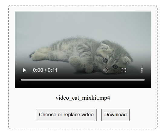
Large media values: media fields embed bytes in the form value. Exporting a large video into a JSON textarea can temporarily freeze the browser because the entire base64 payload must be rendered as text. Prefer an appropriate upload or server-side storage flow for production-scale media.
Some forms use collapsible sections — areas that can be expanded or collapsed to help you focus on what matters and keep the form tidy. These are typically built with the browser’s native <details> element, which shows or hides its contents when you click its heading (the <summary> area).
SmarkForm extends its keyboard navigation to work naturally with collapsible sections:
Enter — When a collapsible section is closed, pressing Enter while in its summary field skips hidden fields and moves to the next visible field.
Shift+Enter — Backward navigation also skips fields hidden in a closed section and leaves it closed.
Alt+Enter — When a collapsible section is closed and you want to navigate forward into its hidden fields, hold Alt while pressing Enter. The section opens and focus moves to the next field inside. From a textarea, hold Ctrl as well.
Alt+Shift+Enter — The backward equivalent: hold Alt+Shift while pressing Enter to open the previous closed section and move to the preceding field inside.
Space — In the summary field of a collapsible section, pressing Space types a space character as usual. The section is not toggled, so you can freely type in the visible field without accidentally collapsing it.
Shift+Space — Hold Shift while pressing Space to fold or toggle the section without typing a space character:
<summary>): toggles the section open or closed.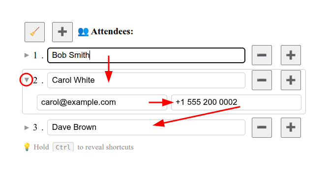
Tip: If a form shows contacts (or other items) as collapsible rows, keep sections closed while scanning the list and use Alt+Enter / Alt+Shift+Enter only when you need to edit a specific item’s details. This keeps the form compact and easy to read.
In a multiline text area, forward navigation requires Ctrl+Enter. To open a collapsed section while moving forward from a textarea, hold Ctrl+Alt; plain Enter inserts a new line.
Note: Not all forms use collapsible sections. This feature is visible only when the form designer has chosen to wrap sections in
<details>elements.
Some forms have sections nested within other sections (like contact details within a contact, or items within an order). From your perspective as a user, these work seamlessly:
Pro tip: You don’t need to think about the form’s internal structure — just navigate naturally and SmarkForm handles the rest!
Forms can include keyboard shortcuts and label associations, but the form’s designer chooses the controls, labels, and available actions. If a label, focus order, keyboard action, or announcement does not work well with your assistive technology, contact the person or organization that provided the form.
For developers building forms, see Accessible Labels and Names for label associations and author responsibilities.
Using assistive technologies? If a form’s labels, focus order or announcements do not work well for you, please report the issue.
Here are some tips to make form filling even faster:
Learn the discovery shortcut — Hold Ctrl to see available hotkeys anytime you’re unsure what actions are available
Use Enter to navigate — It’s faster than Tab for moving between fields, and it skips non-field elements
Master a few common hotkeys — Once you learn hotkeys for common actions (like adding/removing list items), you can use them throughout the form
Try second-level hotkeys — Hold Ctrl+Alt to access outer context actions when working with nested structures
Watch for form controls — Add/remove buttons may disable when list limits are reached. Use the form’s Add control when you need another row.
Use Alt+Enter / Alt+Shift+Enter and Shift+Space in collapsible sections — These shortcuts can open or fold <details> sections while moving through fields; see the key behavior above. From a textarea, forward Enter navigation still requires Ctrl.
Use the keyboard for supported actions — Enter navigation, Tab, and configured hotkeys can reduce pointer use. Available controls depend on the form’s design.
Context-aware shortcuts are a feature — The same hotkey doing different things in different sections is intentional and makes the interface more intuitive
🎯 Want to see SmarkForm in action? Check out the Examples section to explore interactive demonstrations of all these features.
💻 Are you a developer? See the Showcase section for in-depth examples with code, or visit the Branding page to learn how to link to this guide from your own forms.
This guide covers the core user-facing features of SmarkForm-powered forms. The specific features available in any given form depend on how the developer has implemented it.
Questions or issues? Visit the Support page to get help.